An earlier post discussed some of the traditional colors that appear in the Morgan’s block books. In most cases, the hand-applied colors are typical of the dyes and pigments seen in the Middle Ages and Renaissance. However, a few unexpected pigments were discovered during the study of these fifteenth-century books, enabling a better understanding of how some of them were changed over the centuries.
All of the Morgan’s block books were printed on white paper made from processed rags. Many different watermarks have been recorded in these books, and they generally indicate that German and Dutch papers were used. It is common to find three or four different watermarks in one book; these variations support the idea that the block books were printed one at a time, using sheets of paper already present in the printers’ workshop, rather than in large editions using reams of paper procured for the purpose.
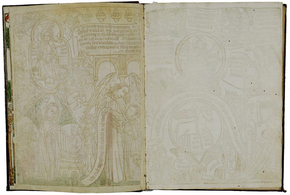
Figures 1–3: Beta radiographs of different watermarks in Apocalypsis Sancti Johannes, PML 8, fols. 26, 39, 23.
These beta radiographs (similar to low level X-radiographs) show us the internal structure of the paper as well as the watermarks by recording the paper’s density as an image. The even distribution of paper fibers demonstrates the high quality of the paper used, and the chain lines (thicker vertical lines) and laid lines (smaller horizontal lines) show how the paper was made1. The lighter shapes in the background areas indicate dense pigments that contain heavy metals (e.g. copper green, red or white lead, vermillion) that block the penetration of the beta particles.
Even when the watermarks vary, the thickness and density of the pages are generally consistent within a volume. When paging through a block book, one might find a thinner, yellower or more brittle sheet, and this is a signal to examine it more carefully. Different paper is often an indicator of a composite book, made mostly of a single fifteenth-century edition but with one or more replacement pages. Replacement pages may be modern facsimiles or pages from another edition of the same block book. These pages were added later to complete a fragmentary or damaged volume, adding to its market value.
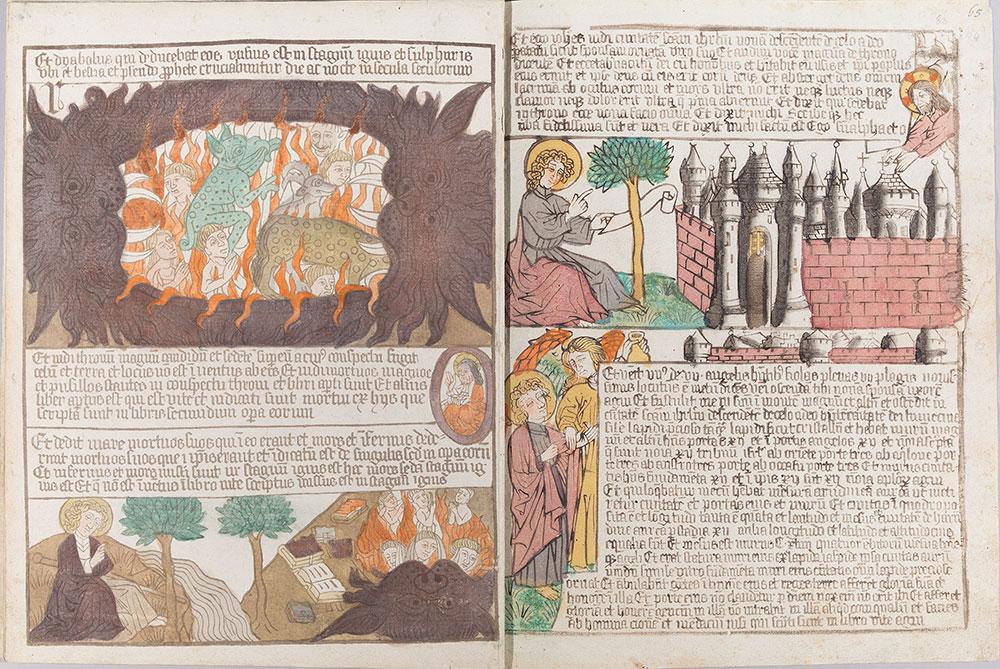
PML 7 is an unbound block book of forty-eight folded leaves purchased by J. Pierpont Morgan in 1902. In this Apocalypsis Sancti Johannes, one folio (64v) depicting the mouth of hell had long been suspect.
When compared to the rest of the volume, the muddiness of some of the colors was atypical as was the density and application style of other colors. The dark purple-red of the hell mouth covers much of the detail of the print and is far less dramatic than in other versions owned by the Morgan, and the red flames are more translucent than the same color on the facing page. The color on this folio (64v) is applied with a more precise hand, carefully stopping at the outlines of the print, rather than the slightly messy overlapping printed lines and adjoining colors seen throughout the volume.
Because this page was noticeably different, it was analyzed by scientists Federica Pozzi and Elena Basso using multiple analytical techniques, and the results were compared with other samples from the remainder of the book2.
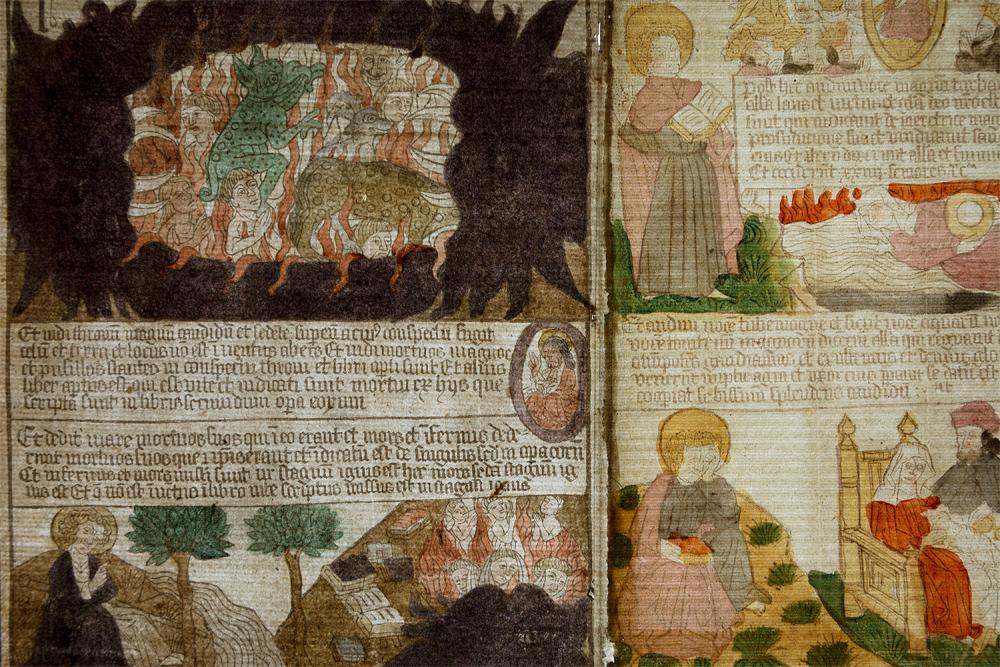
When the folded folio was removed from its place in the quire and placed on a light box, it was clear that fol. 64v, the left side of the spread, was a replacement page. (See figure 6.) In transmitted light, you can see that fol. 64v is physically adhered to fol. 57v along the center fold line. The two pages overlap slightly where they are joined and create the vertical dark line just to the right of center. The variations in the laid and chain patterns and fiber density of the two joined sheets indicates that these are two different papers. Imaging with false color infrared (see figure 7) shows that the printing inks as well as the colors on these attached sheets are different from one another.
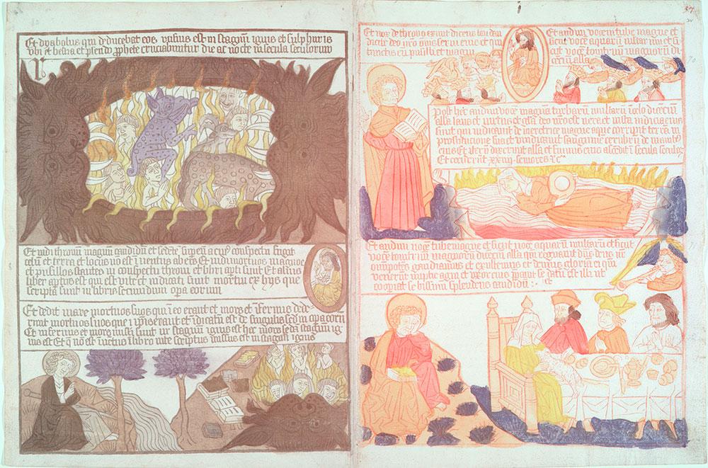
Figure 7: False color infrared image of PML 7, fols. 64v-57v. For more information on FCIR and other imaging techniques see this post
On the right of the spread, you can see that one ink is bright red (indicating a high iron content), while the other is neutral black. The suspect page at left is probably made with carbon-black ink, while the facing page and the remainder of the Apocalypse is iron-gall ink, probably mixed with some small amount of carbon. This shows us that the printing of these two pages was not done at the same time. It seems clear that fol. 64v was added to complete the book, but was this a modern addition or an older repair?
The pigment of the bright-green, polka-dotted monster on this page was identified as an interesting mixture that is unique in our study, probably containing azurite, orpiment, lead white, and barium sulfate. While most of these pigments were known in the fifteenth century, barium sulfate is a white filler3 that was not used in paint until the late eighteenth century. It was found only on this replacement page, mixed in with several colors, not throughout the volume.
Finally, the spotted, olive-green creature at the lower right of figure 8 shows the presence of a mixture of red mineral pigments, including red ochre, red lead, and vermilion, along with chrome yellow (first manufactured in 1797). It is clear that this demon could not have been colored until the nineteenth century. It makes sense that the loss of this page, with its striking image of the Hell mouth, would impact the value of the book, so a replacement page, possibly taken from another incomplete copy of the Apocalypsis, was colored and inserted into this volume after 1800 and before its acquisition by Morgan in 1902.
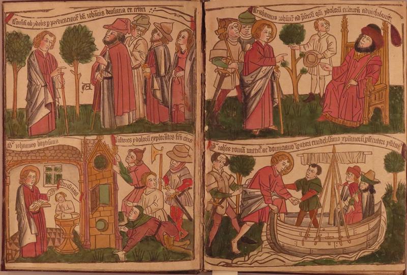
PML 1051, another copy of the Apocalypsis Sancti Johannes in the Morgan’s collection, is considered to be a perfect copy of the fourth edition. However, it is clear that the first four pages of this block book are hand-colored in a different palette from that of the rest of the book. The application of the color is also quite different on these pages when compared to the remainder of the book. (See figures 9, 10.) It was believed that the first four pages were fifteenth-century, hand-colored plates added later, perhaps in the eighteenth century. This assessment was partially based on the decorative, brocade-cloth cover presumed to be the part of the original binding, later incorporated into covers edged with gold-tooled leather in a more modern style. (See figure 11.)
The colors on two pages, one from the first four pages (fol. 2r) and one later in the book (fol. 35v), were analyzed for comparison. The results were unexpected in several ways. The identification of pure yellow ochre in the throne on fol. 2r was unusual. (See image 12.) It is an ancient pigment in use for centuries, but this was the only place it was seen in any of the block books analyzed. All the other yellows were organic dyes or lead-tin yellow. The presence of red ochre mixed with carmine in the king’s red robe, also on fol. 2r, was another unique pigment mixture. In all the other block books, a range of red pigments was identified. Brazilwood, vermillion, and red lead, alone and in mixtures, were common, but carmine was rarely used. Pure red ochre was not seen in any other block book. The fact that these pigments are outliers in our extensive survey of block-book pigments does not make them fake, but it does raise suspicions.
Finally, micro-Raman spectroscopy, a non-destructive technique, showed that emerald green and Prussian blue were mixed to make the green land on fol. 2r. The late dates of these two pigments, ca. 1814 and ca. 1706, respectively, made it clear that this coloring was not original. The identification of this modern mixture proves that these first four pages must have been colored in the nineteenth century in an attempt to match the later pages and complete the book. All the colors tested on subsequent pages were consistent with fifteenth century materials and within the group tested.
We hope to look more closely at the binding structure to see what it can tell us about how and when this composite object was assembled and to do further research on these first four pages to try to determine whether they are modern replacements or older prints colored in the nineteenth century.
There were important visual clues enabling us to identify replacement pages (different paper, different color application and palette), but extensive scientific analysis was needed to attach secure dates to the colors used, most of which looked like fifteenth-century pigments. After extensive analysis of the Morgan’s block-book collection, modern pigments (emerald green, Prussian blue, and chrome yellow) were identified in only these two volumes on replacement pages. Atypical mixtures of pigments were present on both suspicious replacement pages, but without the collection of large amounts of comparative data, we would not have known how unusual these mixtures were. These block books remain important collection items, but this does open questions about how they were assembled and reassembled over their long history.
End notes
- Chain and laid lines indicate that paper was handmade on a screen. See more information on papermaking.
- Federica Pozzi, associate research scientist, and Elena Basso, research associate in the Dept. of Scientific Research, the Metropolitan Museum of Art, New York, N.Y. Non-invasive tools included XRF and Raman spectroscopy for inorganic pigments (earth pigments, often containing metals like iron, lead, copper) and FORS (fiber optic reflectance spectroscopy) for organic materials (such as plant-based dyes). Micro-samples of some pigments and inks allowed us to do SERS (surface enhanced raman spectroscopy) and HPLC (high-performance liquid chromatography) as well as SEM/EDS (scanning electron microscopy with energy dispersive X-ray spectroscopy).
- Definition of a filler (Barium sulfate).
Reba F. Snyder
Paper Conservator
Thaw Conservation Center
The Morgan Library & Museum


