
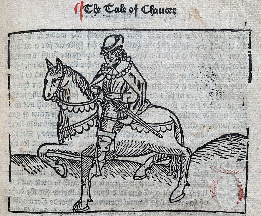
Fig. 1. Geoffrey Chaucer, The Canterbury Tales
(Westminster: William Caxton, 1483). PML 693, fol. A1r.
One of my favorite aspects of my job as a curator at the Morgan Library & Museum is when high school and university classes come to see rare materials. The Morgan is not affiliated with a university, so, like Chaucer’s pilgrims, classes must make a bit of a trek to visit these relics. (Although, the journey to Midtown Manhattan is slightly different than that to Canterbury!) Since my specialty is European early printed books, I get to do a lot of classes on the integration of print into the manuscript world during the 15th century, wherein students are able to see and understand what books were like 500 years ago and how the physical properties of the book are intimately linked to a text’s layout and readability. In our collection, Geoffrey Chaucer’s Canterbury Tales provides an excellent introduction to a text’s development as it moves from manuscript through printed editions.
I begin with our manuscript written in England about 1450–1460 (MS M.249, purchased by J. Pierpont Morgan, 1907). “Yes, this is real,” is the answer to the first question I always get, and to the second, “about as much as a luxury apartment.” However, M.249 is not a luxury manuscript—there is no gold, no illustrations, and no colorful borders—in fact, it is a rather workaday book, which is why it is wonderful for showing to classes. This rather ordinary manuscript is extraordinary in what it reveals about its first owner: they were not interested in an elaborate showpiece—or even a moderate showpiece—but rather commissioned a fairly simple, plain copy of the text on parchment of variable quality. This manuscript was surely intended more for reading than ostentation by an owner who could still afford the expensive production of a manuscript, even if not one of a high quality, and who had the time and ability to read. For me, these socio-economic characteristics of the physical object are critical for the students to understand.
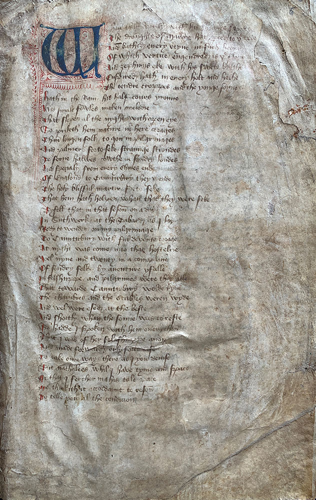
Fig. 2. Geoffrey Chaucer, The Canterbury Tales. England, 1450–1460. M.249, fol. 4r.

Fig. 3. Geoffrey Chaucer, The Canterbury Tales. England, 1450–1460. M.249, fol. 106v.
I always ask the students to think about the modern version of Canterbury Tales they have been reading: What does a page look like? How much text is on a page and how large is it? How is the text arranged and divided? What elements are included to help you find your way through the text? And then consider the manuscript in front of them…and try to read it.
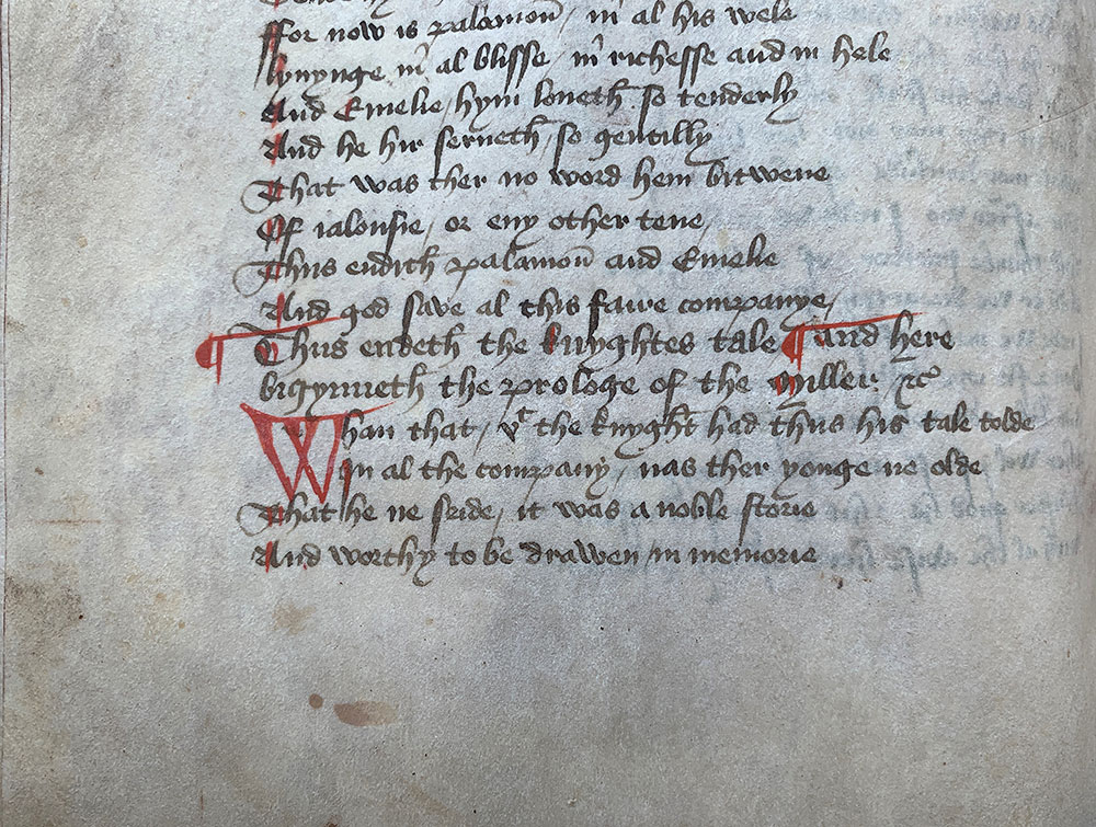
Fig. 4. Geoffrey Chaucer, The Canterbury Tales. England, 1450–1460. M.249, fol. 44v.
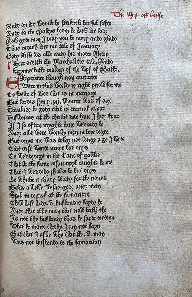
Fig. 5. Geoffrey Chaucer, The Canterbury Tales (Westminster: William Caxton, 1476–1477). PML 674, fol. [17]/2r.
The text of M.249 is laid out in single columns of evenly-spaced lines. There aren’t any blank lines dividing stanzas or textual breaks; the text block has a rather condensed appearance. The main textual demarcation comes from the 2- or 3-line red initials beginning the individual prologues and tales and the red paragraph marks set just to the left the text block. There are no (original) folio or page numbers. The headline, the title of the tale, at the top of the page is the primary means of finding your way through the work.
There is a clear and direct transition from the M.249 to the first edition printed by William Caxton about 1476–1477 (PML 674, purchased by Pierpont Morgan with the Bennett collection, 1902; ISTC ic00431000). Caxton reproduced in print a Canterbury Tales manuscript of similar type to M.249 in page organization and textual demarcation. After learning the technology of printing with movable type in Cologne around 1471–1472, printing with local craftsmen in Ghent and Bruges 1473–1476 , he opened the first English press at Westminster Abbey around 1476 and inaugurated his press with Canterbury Tales. As was common with early printed books, the text was reproduced mechanically, but the large initials, paragraph marks, and headlines were still required to be added by hand after the printed text was completed and purchased by its first owner. The layout of the text, wherein there are no spaces for illustration and the spaces left for initials are rather limited, suggest that Caxton was not aiming this production for an elite, luxury market but rather more to the same socio-economic stratum as the manuscript—the socio-economic class to which Caxton himself belonged.
The strong, black ink and sharp regularity of the letters typically make the printed edition a bit easier for students to read, even if the tall-s and curl on the final d cause momentary confusion. As with the manuscript, there are no blank lines to break up the text in this first printed edition and this solid text block frequently causes readers to lose their place in the mass of black squiggles.
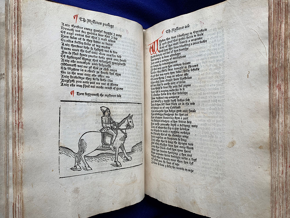
Fig. 6. Geoffrey Chaucer, The Canterbury Tales (Westminster: William Caxton, 1483). PML 693, ff. g4v–g5r.
Fig. 6. Geoffrey Chaucer, The Canterbury Tales (Westminster: William Caxton, 1483). PML 693, ff. g4v–g5r.
Caxton improved this ‘readability’ in his second edition, printed in 1483, by using blank lines to demarcate the tales and including woodcuts illustrating the pilgrims in the Prologue and introducing the individual tales (PML 693, purchased by Pierpont Morgan with the Bennett collection, 1902; ISTC ic00432000). The blank lines and woodcuts seem to visually explode the text block, making it more readable by giving both the text and your eyes a bit of space to breathe. Although the headlines are now printed, Caxton still left spaces for all of the major initials to be added by hand. (It was not until the 4th printed edition in 1498 that the work would be typographically complete, without the need for any red manuscript additions.) As printed books became more common, readers grew accustomed to growing lack of color, and perhaps they even enjoyed the fact that they didn’t have to pay another craftsperson to add red initials and apparati to their copy before they could read the text. Manuscripts with illustrations of the riders are rare, luxurious creations, yet with this edition Caxton is providing that visual luxury to a less restricted reading market.
Caxton wrote his own prologue to this edition, in which he says that a customer came into his shop one day complaining that Caxton’s first printed edition was different than the manuscript his family owned. Caxton used this man’s manuscript to produce his new, improved second edition. Was this manuscript illustrated? Was the text divided up with blank lines? What elements of page layout or textual demarcation might Caxton have derived from this exemplar? Textually, Caxton’s second edition is a class unto itself with no manuscript copies sharing the same textual irregularities. I cannot help but wonder if this was one of the first marketing ploys to sell more books. Whether this man and his manuscript ever existed, Caxton is going to great lengths to underscore the improved quality of this new edition, printed only six or seven years after the first. Even if you had the first edition, you are also going to want to buy Caxton’s new Canterbury Tales 2.0.
In fewer than ten years, William Caxton started changing the way England read. The early printed book is more than a textual vehicle. It is also a socio-economic artifact straddling the line between the development of printing technology and the desires and expectations of readers. It is important for students to understand the various ways that medieval and early modern texts were produced and preserved and what that history might be able to tell us about our own bookish expectations.
John T. McQuillen
Associate Curator
The Morgan Library & Museum